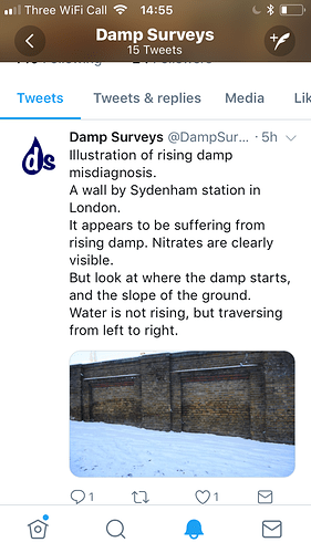
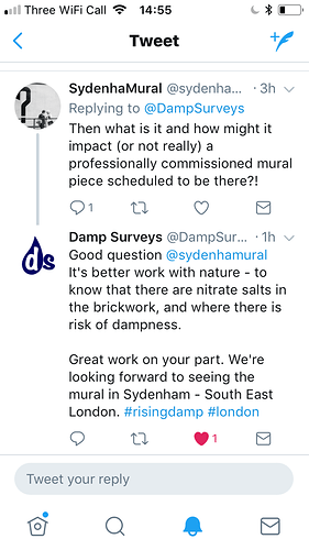
I wouldn’t bother with the damp company, they are just touting for work. There is, however, a surface issue with this wall, which has been pointed out by one of the artists. Salts on the brickwork will be hard to manage, and once such a reaction is set up, it continues. If this wall is to be decorated, perhaps it would be longer lasting if it could be done on metal signs, attached to the wall. I am quite disappointed that the organiser is so reluctant to hear anyone who says this wall is not the best site. I know it is difficult once your heart is set, but if this mural is to truly represent the community, other people need to be heard too.
I still think the bridge is the best site. Saying it isn’t high enough ignores the fact that it sits on the crest of the hill, and therefore is more visible than if the ground were flat. There is also the determination that the mural should be a banner shape. Unfortunately, we have no suitable walls, other than the Southend Road rail bridge. Someone on another forum suggested a mural that could be repeated, sort of branding the area. If mural was designed in a squarer format, Sydenham on top with se26 beneath, it could be repeated in many smaller sites along the main road. What about repeats in each panel of the bridge wall.
Please believe that this project is brilliant, and you are doing an excellent job running it. I just feel that Sydenham deserves a symbol that represents the community best.


